지난주 목요일 밤, 블로그 스킨을 바꿔보려고 티스토리 스킨 갤러리를 뒤지고 있었습니다. 한 시간쯤 지났을까요. 디자인이 마음에 드는 건 SEO가 엉망이고, SEO가 괜찮은 건 2019년에 시간이 멈춰 있는 비주얼이더라고요. 그래서 직접 만들었습니다.

오늘 소개할 Soft Neutral은 "깔끔하면서도 SEO를 포기하지 않는" 티스토리 스킨입니다. 둥근 카드 UI, 뉴트럴 톤 컬러, 그리고 JSON-LD 구조화 데이터까지 내장했습니다. 무료 배포니까 편하게 가져가세요.
왜 또 티스토리 스킨을 만들었나
기존 스킨들에 불만이 좀 쌓여 있었습니다. 제가 원하는 조건은 딱 세 가지였거든요.
첫째, Google에서 제대로 인식되는 구조화 데이터. 둘째, 2026년에 봐도 촌스럽지 않은 디자인. 셋째, 다크 모드. 이 세 가지를 동시에 충족하는 무료 스킨이 생각보다 없었습니다. 유료 스킨 중에는 괜찮은 게 몇 개 있긴 한데, 커스터마이징이 제한적이거나 코드가 지저분한 경우가 많았습니다.
- Backlinko의 Technical SEO 가이드(2026) 에서도 강조하듯이, 블로그 SEO의 기본은 구조화 데이터와 메타 태그 최적화입니다. 이전에
- 블로그 SEO 최적화를 직접 해본 결과 글에서도 공유했지만, 구조화 데이터 하나만 제대로 넣어도 검색 노출이 확연히 달라집니다. 근데 대부분의 티스토리 스킨은 이걸 신경 쓰지 않더라고요. 아니, 정확히는 og:title 하나 넣어놓고 "SEO 최적화 완료"라고 써놓은 경우가 태반이었습니다.
그래서 처음부터 SEO를 뼈대로 잡고, 그 위에 디자인을 얹는 방식으로 접근했습니다. MCP(Model Context Protocol)를 활용해서 AI 에이전트와 함께 작업했는데, 이 부분은 MCP로 AI 에이전트 연결하기 글에서 다뤘던 내용과 맥이 닿습니다.
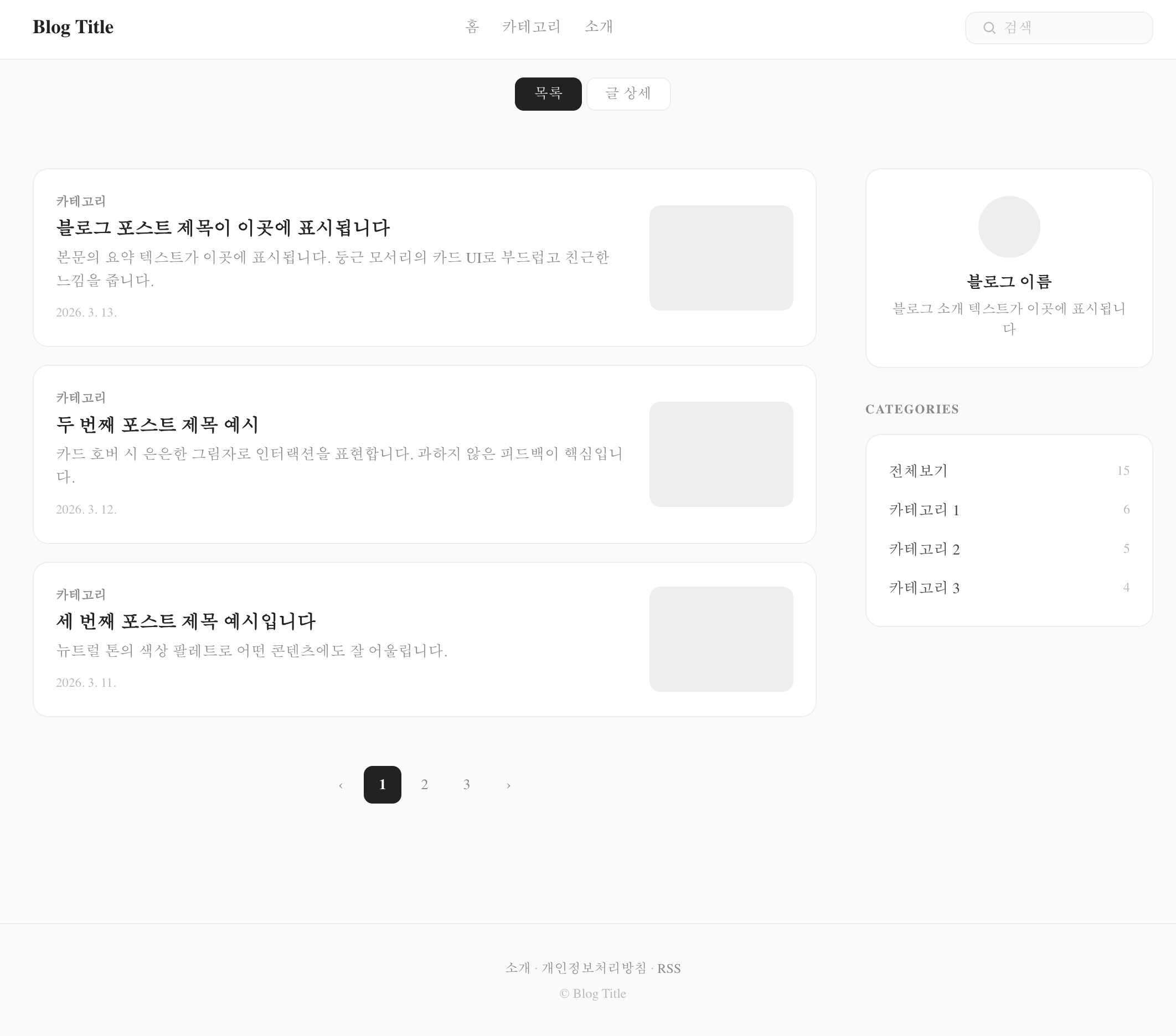
Soft Neutral 스킨, 뭐가 다른가
한 줄로 정리하면 "겉은 미니멀, 속은 풀스택 SEO"입니다.
디자인: 둥근 카드 UI + 뉴트럴 톤
요즘 웹 디자인 트렌드를 보면 과도한 장식보다는 여백과 타이포그래피로 승부하는 방향으로 가고 있습니다. Figma의 2026 웹 디자인 트렌드 리포트에서도 "미니멀이 지루한 게 아니라, 클린 레이아웃에 볼드 타이포나 컬러 포인트를 얹는 방식"이 주류라고 분석했는데요.
Soft Neutral은 이 방향에 맞춰서 설계했습니다.
배경 #fafafa, 카드 #fff, 텍스트 #222 눈이 편한 뉴트럴 조합 border-radius: 14px 둥근 카드로 부드러운 인상 hover 시 box-shadow: 0 2px 12px rgba(0,0,0,0.04) 아주 살짝만 떠오르는 느낌 애니메이션? 없습니다. transition: 0.15s면 충분합니다 과한 그라데이션이나 글래스모피즘 같은 건 일부러 뺐습니다. 블로그 템플릿이라는 게 결국 "글"이 주인공이어야 하니까요.
SEO: JSON-LD 구조화 데이터 4종 내장
여기가 이 스킨의 핵심입니다. 대부분의 티스토리 스킨이 Open Graph 태그 정도만 넣는 데 비해, Soft Neutral은 4가지 JSON-LD 스키마를 내장했습니다.
특히 BlogPosting 스키마는 개별 글 페이지에서만 렌더링되도록 s_permalink_article_rep 블록 안에 넣었습니다. 목록 페이지에서 불필요하게 뿌려지지 않도록요. Positional의 Structured Data SEO 가이드(2025)에서 권장하는 패턴 그대로입니다.
그 외에도 이런 것들이 들어가 있습니다:
Open Graph + Twitter Card 메타 태그 완비 canonical URL 자동 설정 robots 메타 태그 RSS 피드 링크
성능: MutationObserver 기반 리소스 최적화
티스토리의 고질적인 문제 중 하나가 플랫폼이 자동으로 주입하는 스크립트와 스타일입니다. 광고 스크립트, 통계 코드, 기본 CSS 등이 사용자 동의 없이 에 들어오는데, 이게 페이지 로드 속도를 심하게 잡아먹거든요.
Soft Neutral은 MutationObserver를 사용해서 이런 불필요한 리소스를 실시간으로 감지하고 차단합니다.
// MutationObserver로 티스토리 자동 주입 리소스 차단 const observer = new MutationObserver((mutations) => { mutations.forEach((mutation) => { mutation.addedNodes.forEach((node) => { if (node.tagName === 'LINK' || node.tagName === 'SCRIPT') { const src = node.href || node.src || ''; if (shouldBlock(src)) { node.remove(); // 불필요한 리소스 제거 } } }); }); }); observer.observe(document.head, { childList: true }); 추가로 IntersectionObserver를 활용한 레이지 로딩도 구현했습니다. 댓글 반응 버튼이나 코드 하이라이팅 같은 무거운 기능은 뷰포트에 들어올 때만 로드됩니다. AI가 코드리뷰를 대신할 수 있을까? 글에서도 다뤘지만, 이런 성능 최적화 코드는 AI 코딩 도구의 도움을 받으면 작성 속도가 확 빨라집니다.
다크 모드: prefers-color-scheme 자동 전환
별도 토글 버튼 없이 OS 설정을 따라 자동으로 전환됩니다. CSS 커스텀 프로퍼티만 바꿔치기하는 방식이라 JS 없이 동작하고, 플리커링(깜빡임)도 없습니다.
@media (prefers-color-scheme: dark) { :root { --ink: #eee; --text: #ccc; --bg: #111; --card: #1a1a1a; --line: #2a2a2a; } } 다크 모드에서 카드 배경은 #1a1a1a, 전체 배경은 #111로 미묘한 단차를 줬습니다. 완전한 블랙(#000)은 장시간 읽기에 오히려 피로하거든요.
접근성: 스크린 리더부터 키보드 내비게이션까지
사실 이 부분은 눈에 잘 안 보이는 영역인데, 개인적으로 꽤 공을 들인 부분입니다.
스킵 링크: 본문 바로가기 링크 (Tab 키로 접근 가능) sr-only 클래스: 스크린 리더 전용 텍스트 ARIA 라벨: 검색, 네비게이션 등 인터랙티브 요소 focus-visible: 키보드 내비게이션 시 포커스 표시 reduced-motion: prefers-reduced-motion: reduce 미디어 쿼리 지원 print 스타일: 인쇄 시 불필요한 요소 숨김 Global Reach의 AI 검색 최적화 가이드(2025)에서도 접근성과 구조화 데이터가 AI 검색 엔진(ChatGPT, Perplexity 등)의 인용에 유리하다고 분석했습니다. SEO를 넘어서 GEO(Generative Engine Optimization) 관점에서도 의미가 있는 작업이었습니다.
설치 방법 (5분이면 끝)
설치가 어려운 스킨은 아무리 좋아도 안 쓰게 되더라고요. 그래서 최대한 간단하게 만들었습니다.
1단계: 스킨 zip 파일을 다운로드합니다.
2단계: 티스토리 관리자 꾸미기 스킨 변경으로 이동합니다.
3단계: 우측 상단 "스킨 등록" 버튼을 클릭하고, zip 파일을 업로드합니다.
4단계: 적용 완료. 끝입니다.

커스터마이징 가이드
index.xml에서 설정할 수 있는 옵션들입니다. 코드 수정 없이 티스토리 관리자 화면에서 바로 변경 가능합니다.
옵션 설명 기본값 sidebarPosition 사이드바 위치 right (none 선택 시 1단 레이아웃) isIndex 홈페이지 H1 태그 사용 체크 시 블로그명을 H1으로 showAbout 사이드바 소개 모듈 표시 nav1 ~ nav3 상단 네비게이션 링크 3개 커스텀 링크 설정 가능 사이드바가 필요 없으면 sidebarPosition을 none으로 바꾸면 됩니다. 그러면 콘텐츠가 중앙 정렬된 1단 레이아웃으로 전환됩니다. 개인적으로는 글 위주 블로그라면 1단 레이아웃이 더 깔끔하다고 생각합니다.
목표 vs 현실: 솔직한 회고
원래 계획은 이랬습니다.
5가지 시안을 만들고 하나를 선택해서 깔끔하게 완성 현실은 좀 달랐습니다. 처음 만든 5개 시안이 전부 너무 화려했습니다. Neo Brutalism, Glassmorphism, Bento Grid... 이름만 들어도 "이건 템플릿으로 공유하기엔 너무 개성이 강하다"는 걸 알 수 있죠. 그래서 전부 갈아엎고 미니멀 방향으로 다시 5개를 만들었습니다.
최종 선택한 Soft Neutral은 "누구에게나 무난하면서도 지루하지 않은" 밸런스를 목표로 했습니다. border-radius 14px이 주는 부드러움, hover 시 아주 살짝 떠오르는 카드, 뉴트럴 톤의 안정감. 이 정도면 기술 블로그든 일상 블로그든 무리 없이 어울린다고 판단했습니다.
아쉬운 점도 있습니다. 토글 방식 다크 모드를 넣고 싶었는데, localStorage에 의존하면 티스토리 환경에서 플리커링이 생기는 문제가 있어서 OS 연동 자동 전환으로 타협했습니다. 다음 버전에서는 이 부분을 개선할 계획입니다.
기술 스택 정리
항목 내용 폰트 Pretendard (CDN, woff2, font-display: swap) 레이아웃 2단(콘텐츠 680px + 사이드바 260px) / 1단 선택 가능 반응형 860px (1단 전환), 600px (모바일 최적화) 다크 모드 prefers-color-scheme 자동 전환 SEO JSON-LD 4종, OG, Twitter Card, canonical, robots 성능 MutationObserver 리소스 차단, IntersectionObserver 레이지 로딩 접근성 skip-link, sr-only, ARIA, focus-visible, reduced-motion, print
다음 계획
버전 1.0.0이니까 앞으로 개선할 것들이 꽤 있습니다.
다크 모드 수동 토글 추가 (플리커링 해결 후) 코드 하이라이팅 테마 커스터마이징 옵션 목차(TOC) 자동 생성 기능 댓글 영역 디자인 리뉴얼 피드백이나 버그 리포트는 댓글로 남겨주시면 반영하겠습니다. 사족을 붙이자면, 이 스킨을 만들면서
-
AI 코딩 도구 비용 전쟁 2026 글에서 다뤘던 Claude Code를 꽤 많이 활용했는데, 스킨 코딩 같은 반복적인 작업에서는 확실히 생산성이 올라가더라고요.
-
Claude Code로 2주 만에 SaaS를 완성한 경험 에서도 느꼈지만, AI와 함께 코딩하면 반복 작업에서 시간을 절약하고 더 중요한 설계에 집중할 수 있습니다.
함께 읽으면 좋은 글:
-
블로그 SEO 최적화 직접 해본 결과: 3주 만에 방문자 3배 - SEO 최적화 실전 경험담
-
Claude Code로 2주 만에 일본어 학습 SaaS 완성하기 - AI 코딩으로 프로젝트 빌드하기
-
내가 AI 도구를 3개월 써본 솔직 후기 - AI 도구 실사용 리뷰
-
MCP(Model Context Protocol)로 AI 에이전트 연결하기 - AI 에이전트 프로토콜 실전 가이드 참고 자료:
-
Global Reach - Boost AI Organic Visibility with Smart Structured Data